
Barclays – Lines & Dots Animations
LINES
/ CONCEPTING / ART DIRECTION / GRAPHIC DESIGN /
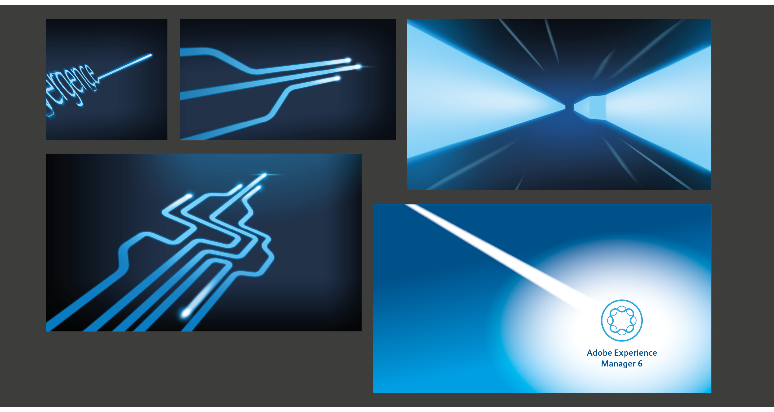
Barclays were upgrading their outdated CMS system to to a new efficient single system. The project was to produce internal facing communications that can be used to create a buzz, provide clarity and inspire passion about the project.

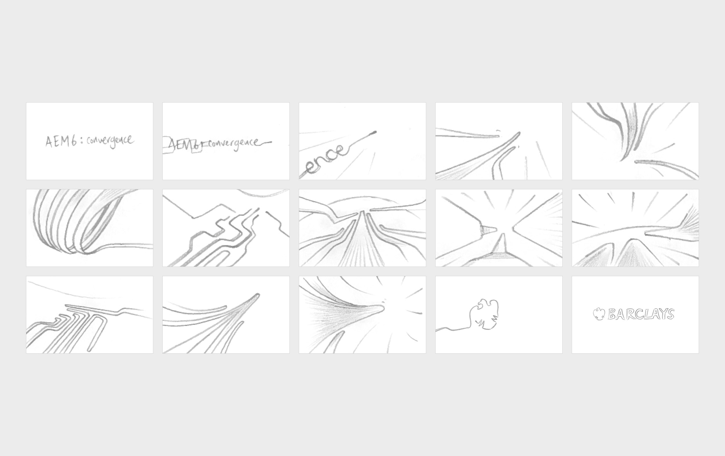
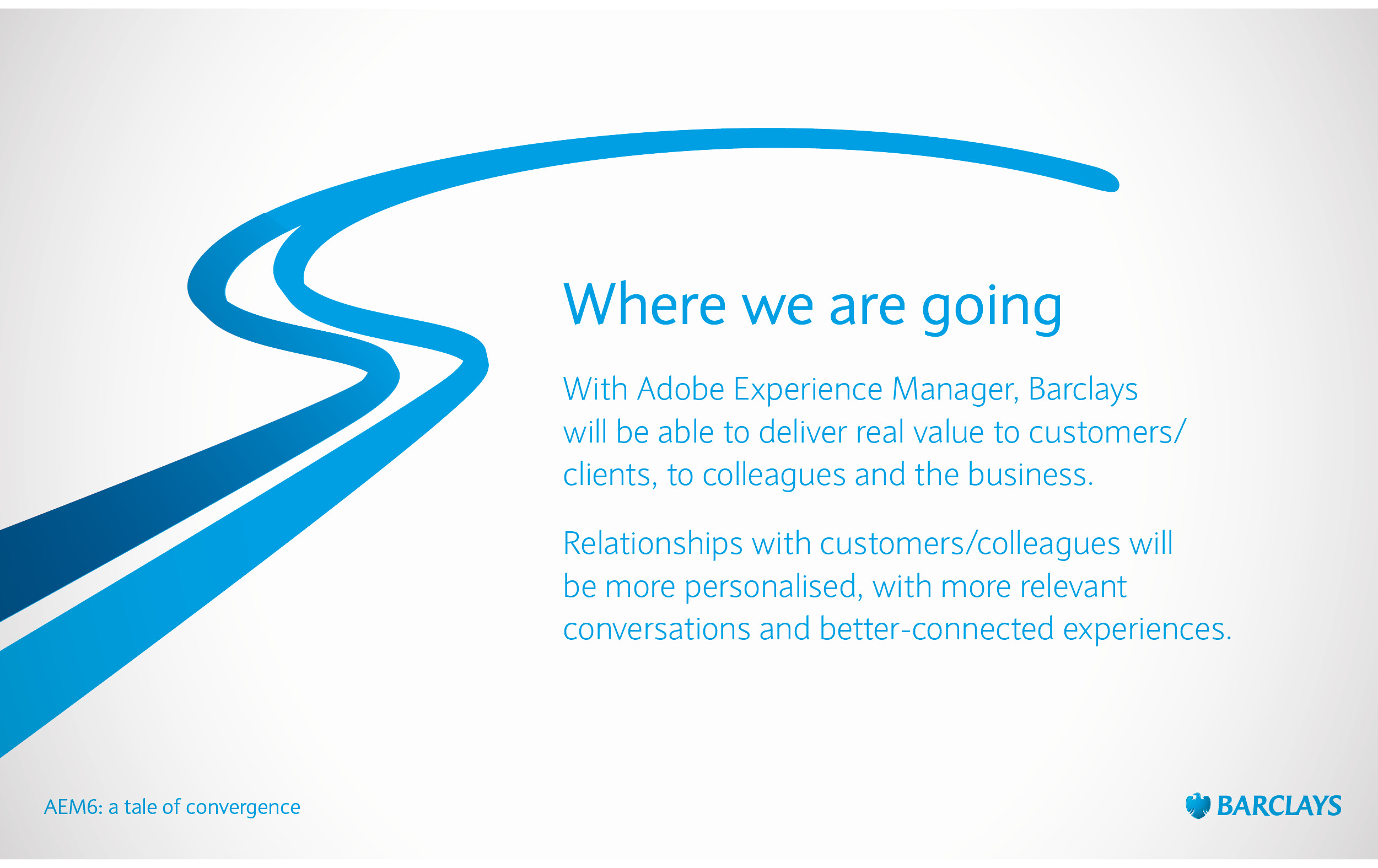
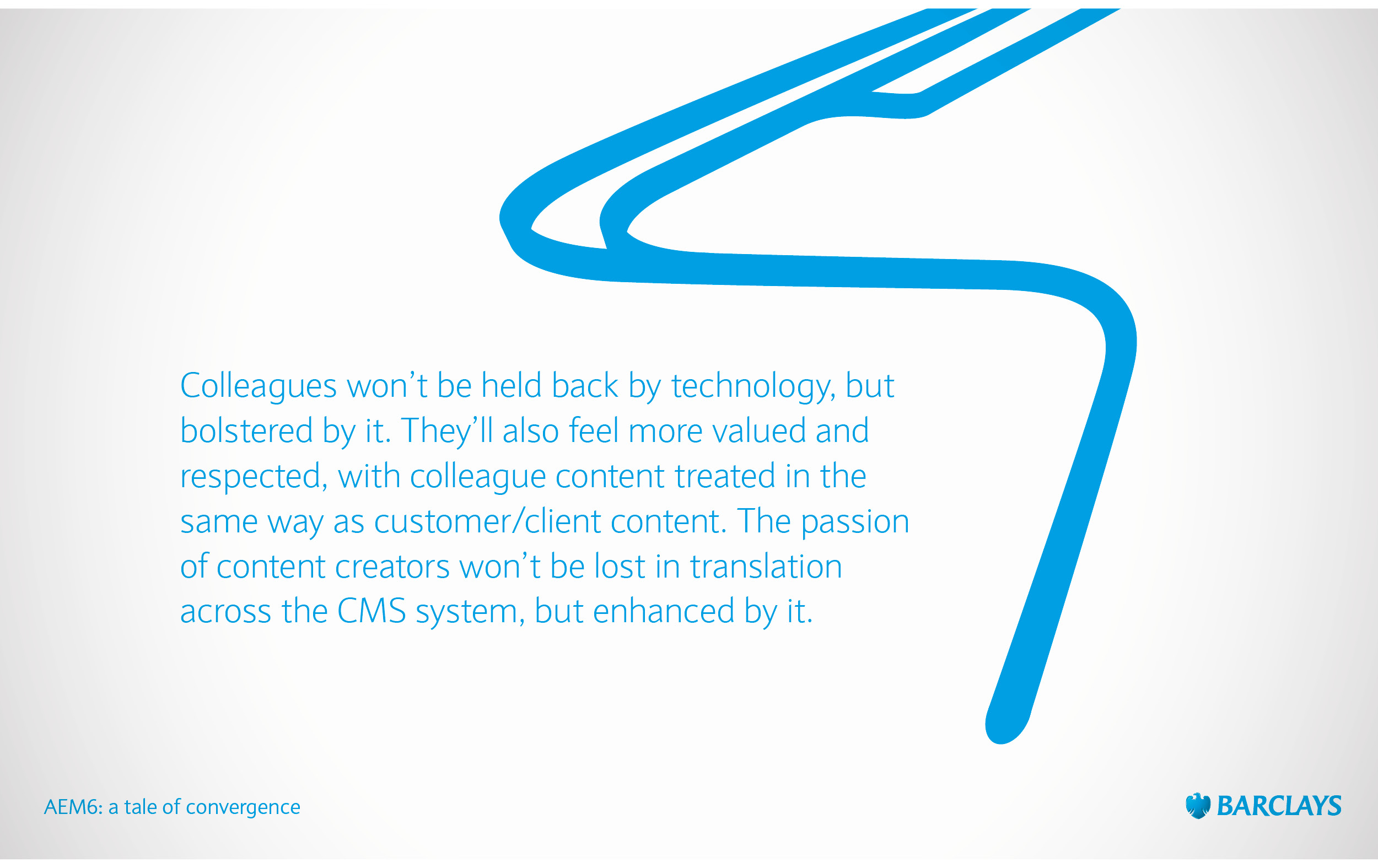
A simple lines concept was selected as a strong visual metaphor for convergence and together with a new narrative, developed into an internal presentation deck and this Tron-like animation.



Dots
We were also asked to explore ways that the five-step customer data protection process can be translated into a simple, engaging and warm animation and used to educate colleagues (and potentially customers in the future).
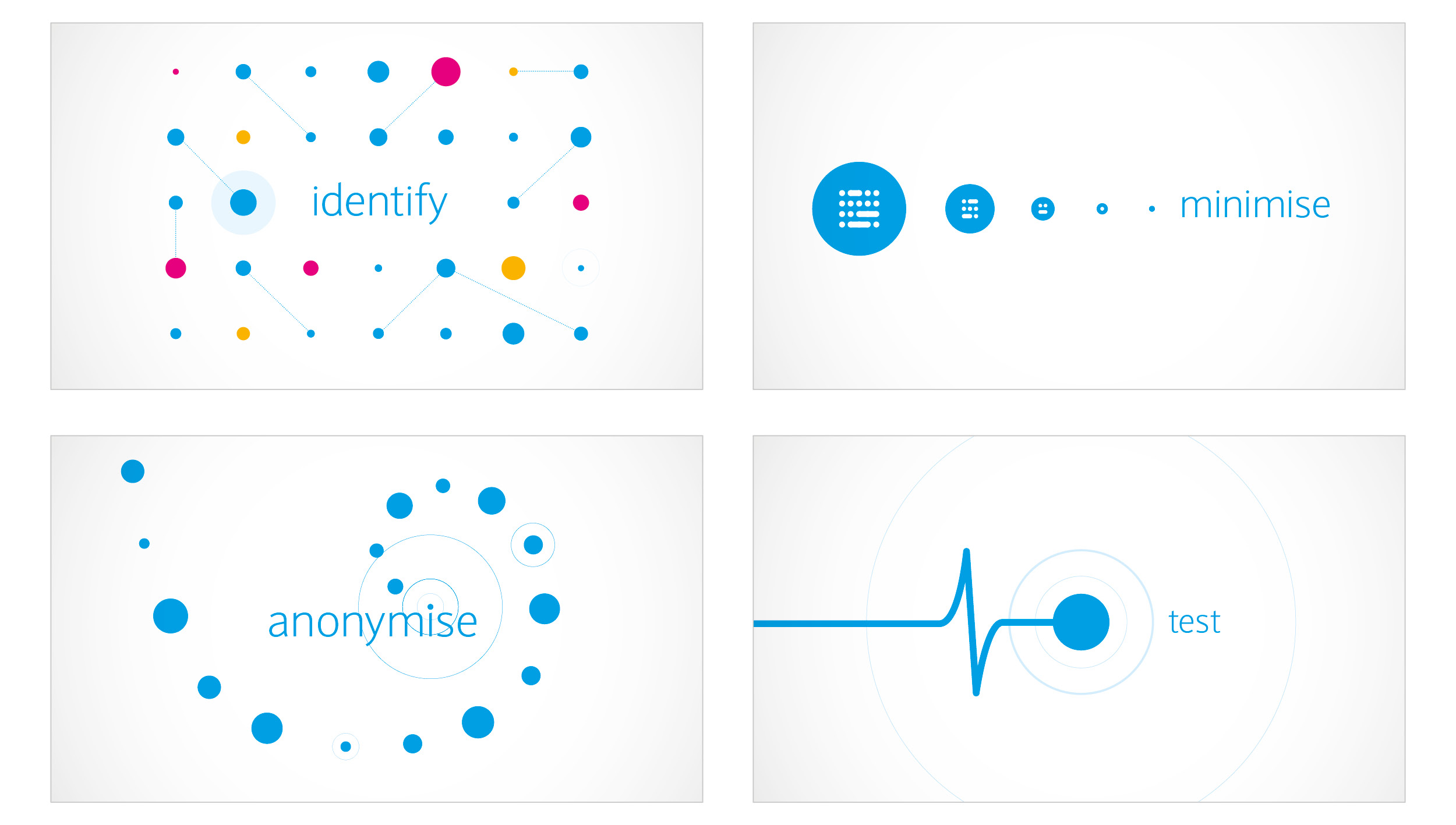
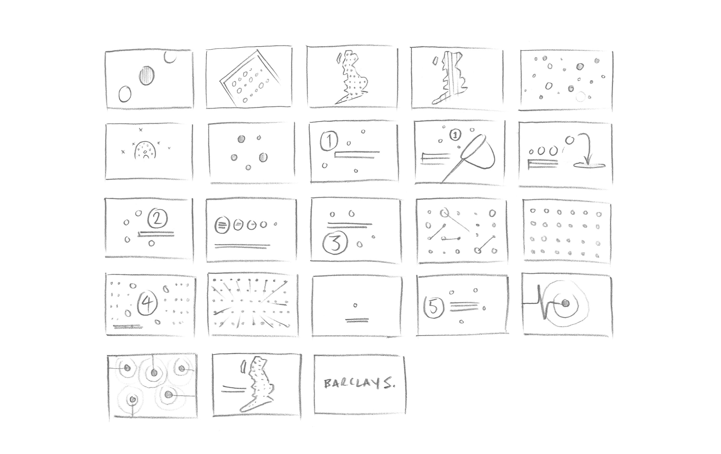
The concept was simple dots to represent data. A generic shape that can be filled with personality by adding colour and movement. From a single dot to a screen full of dots all interacting together, our dots would be flexible, expressive and alive whilst being simple to create and animate.

