Codemasters – Branding
Codemasters Rebrand
/ CONCEPT / ART DIRECTION / GRAPHIC DESIGN /
Codemasters decided it needed a fresh look at its brand identity, to bring it more in line with the modern games world. An identity which captured its creativity and confidence, and helped to further its reputation as a bit of a maverick in the industry.

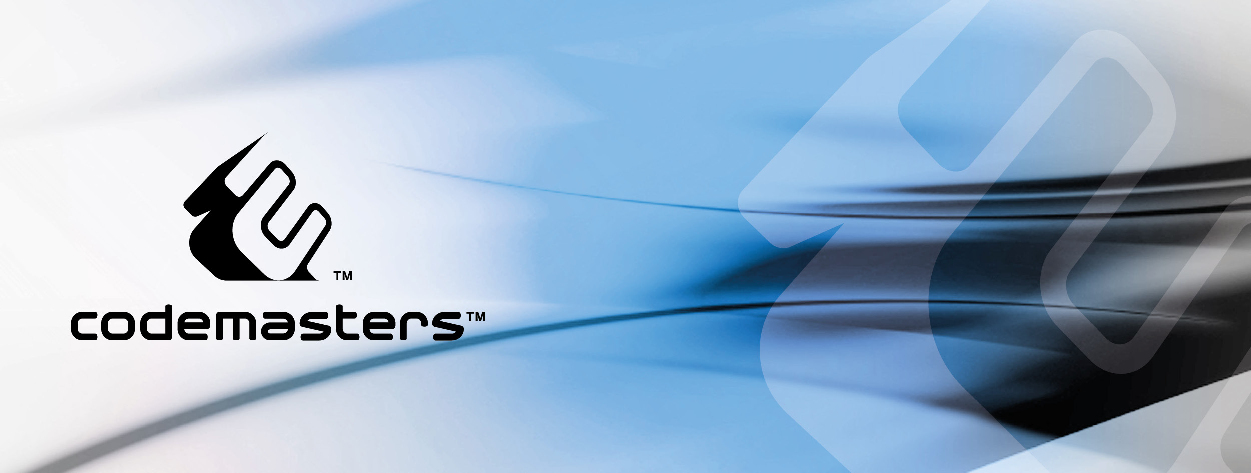
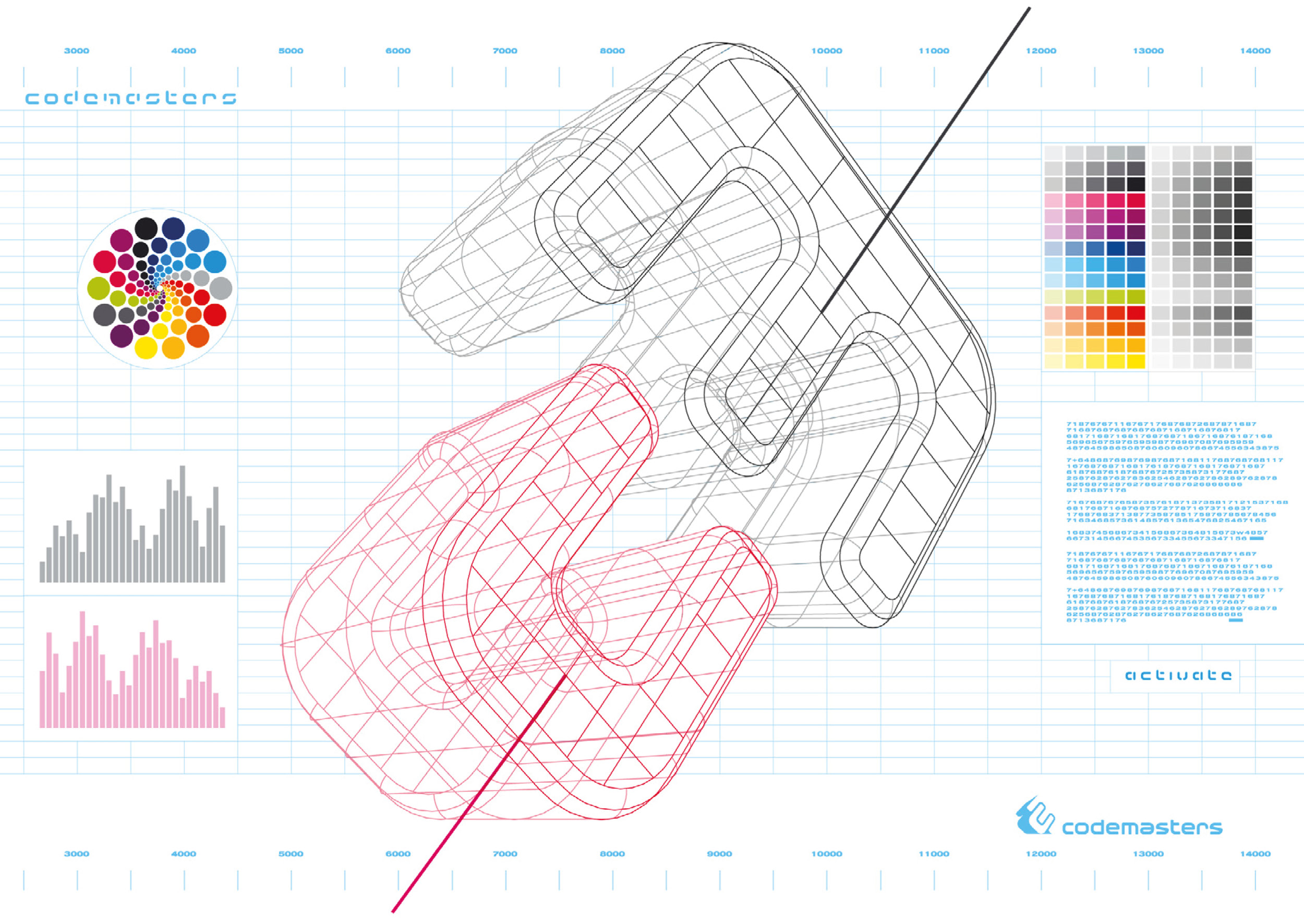
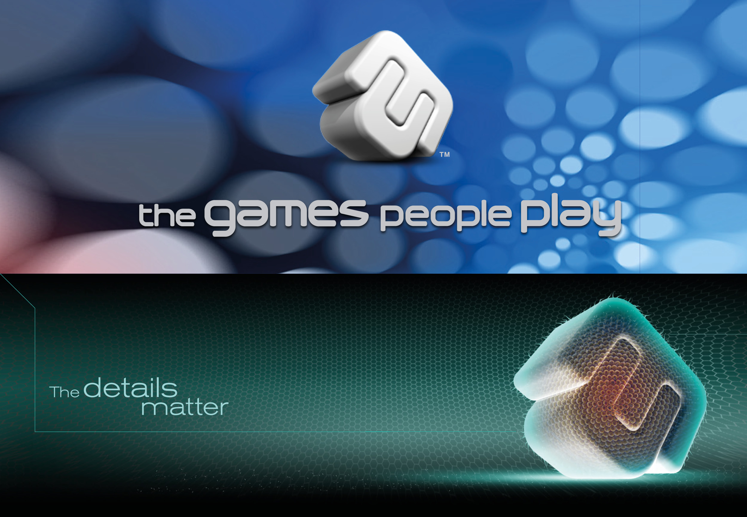
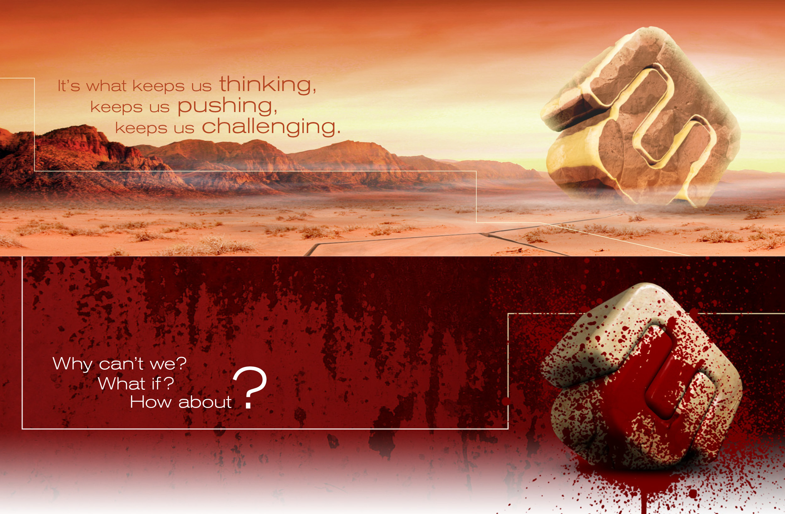
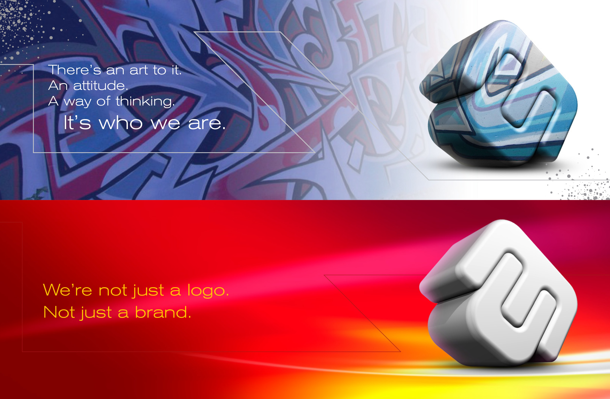
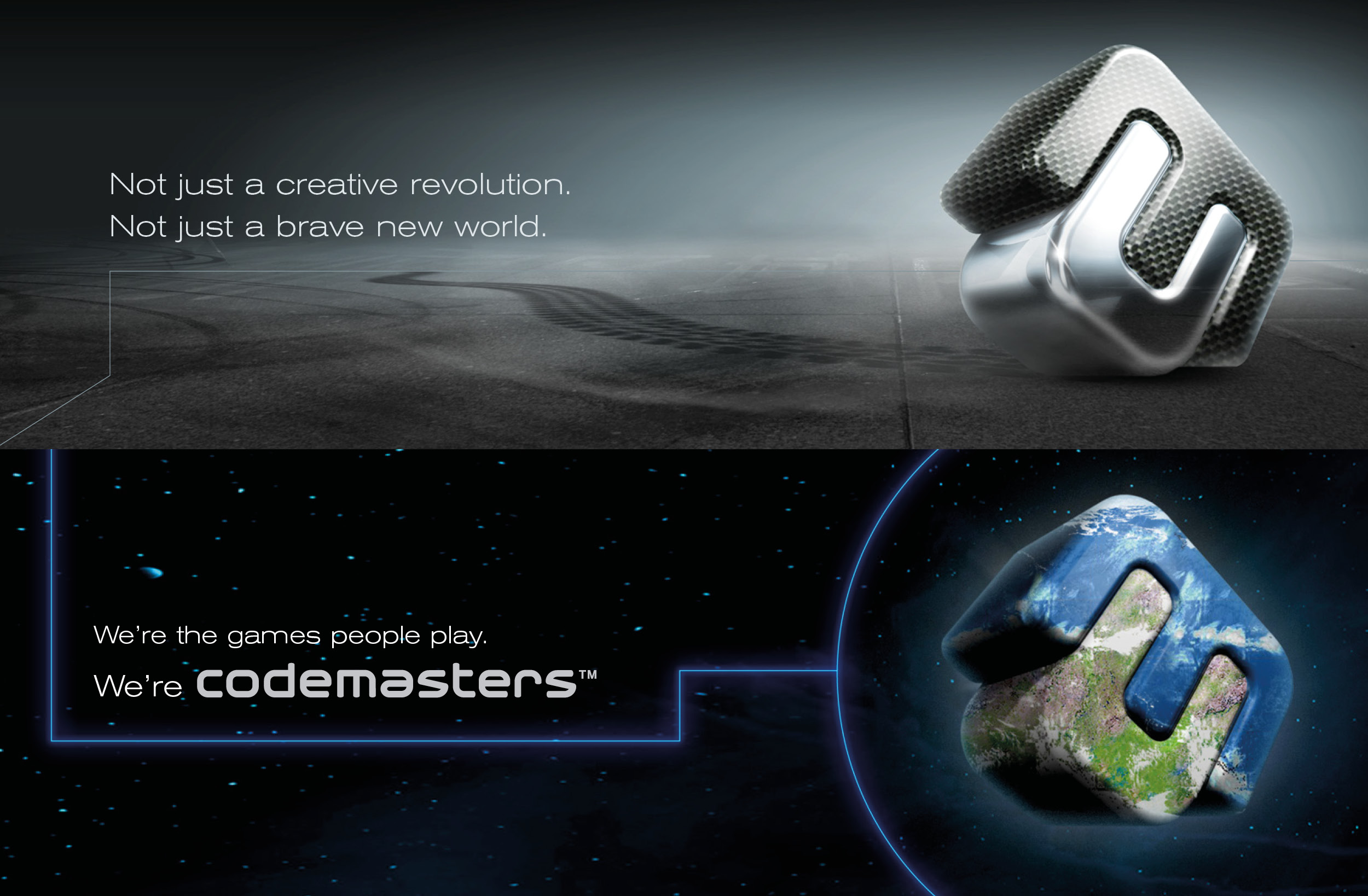
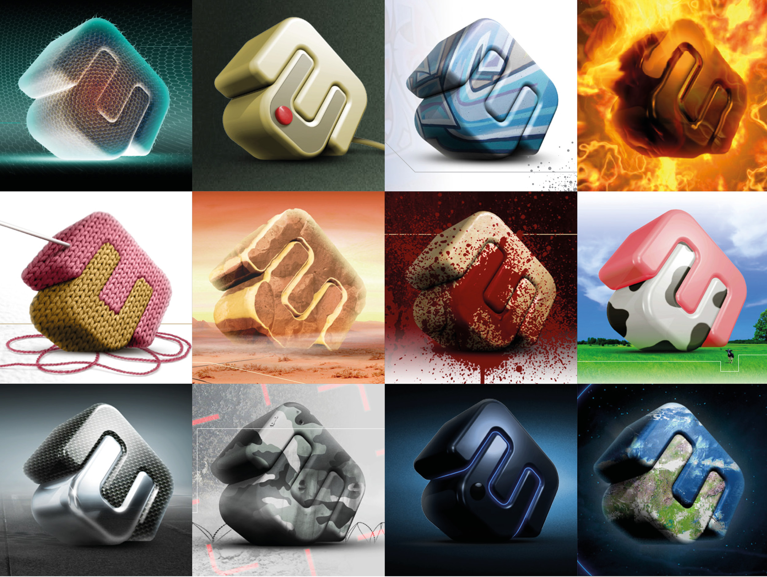
The solution was a logo which could take on multiple personalities. Designing a simple interlocking C and M set the foundations for the fun to come.
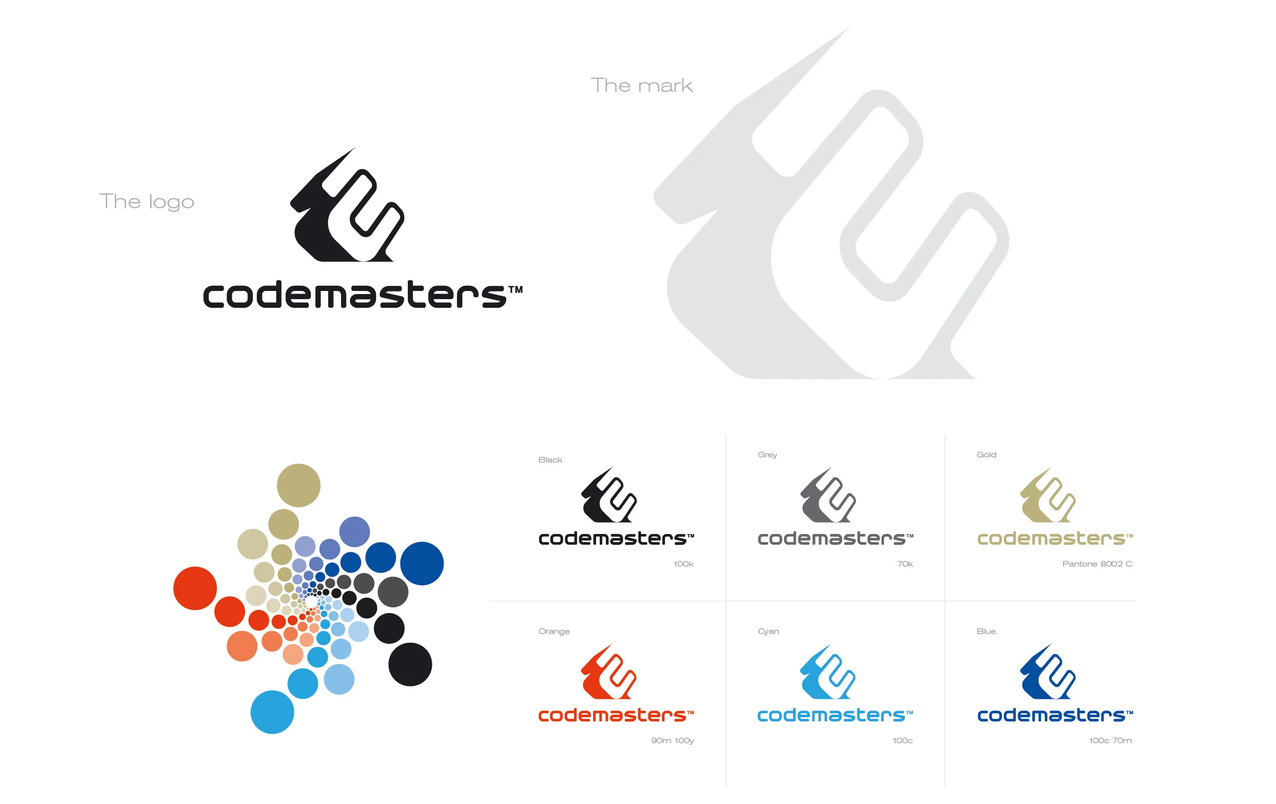





IMPLEMENTATION
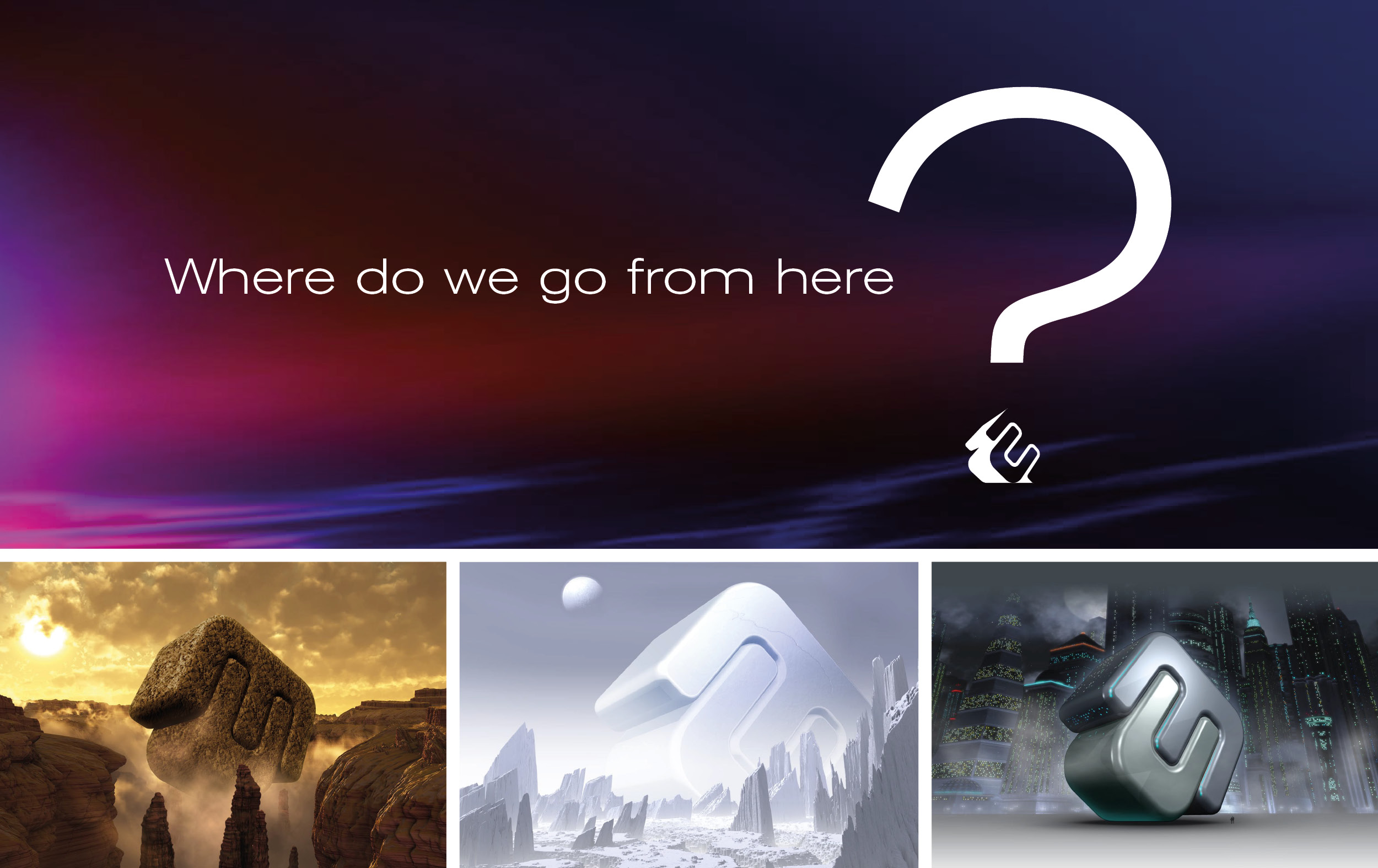
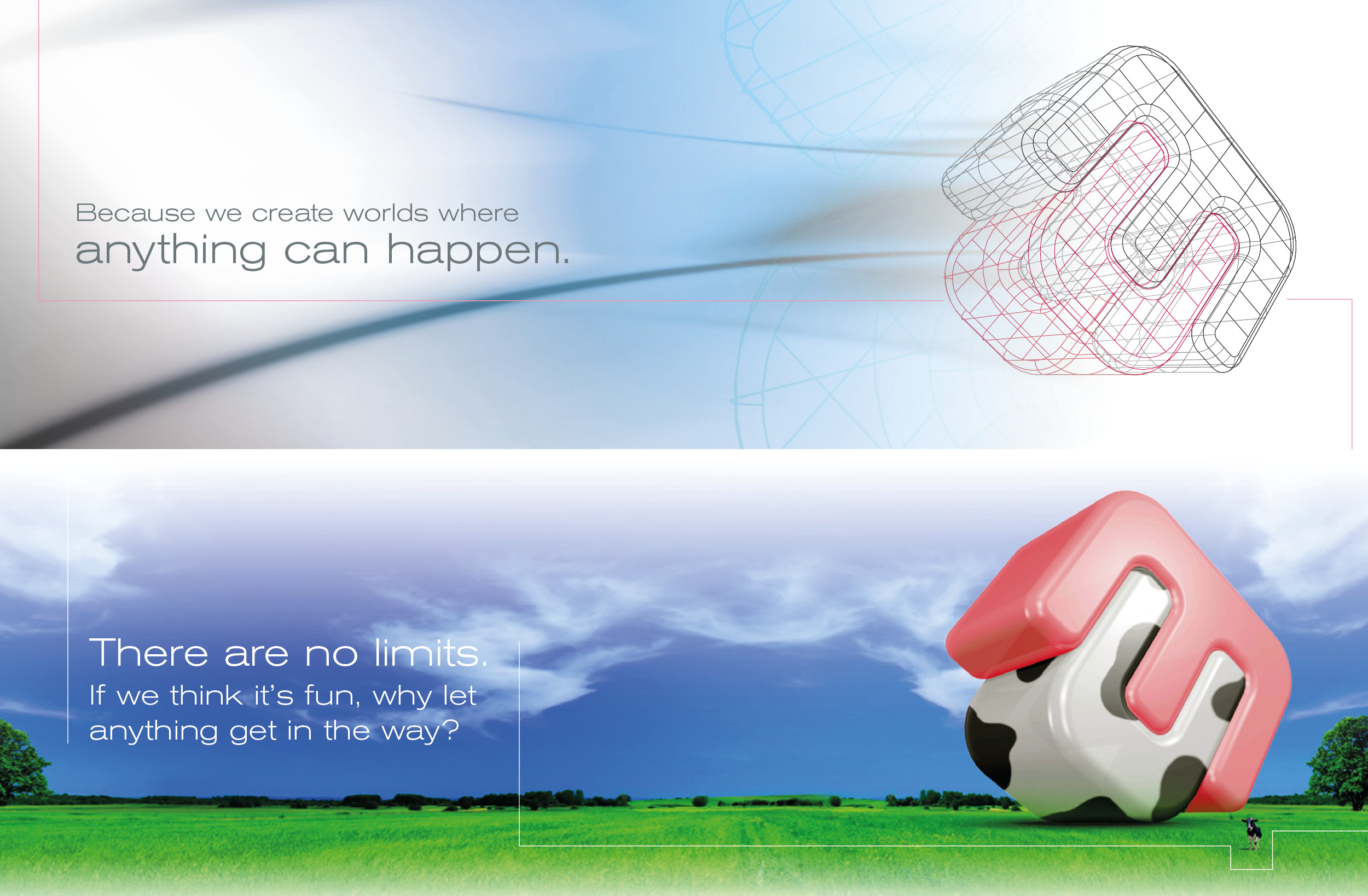
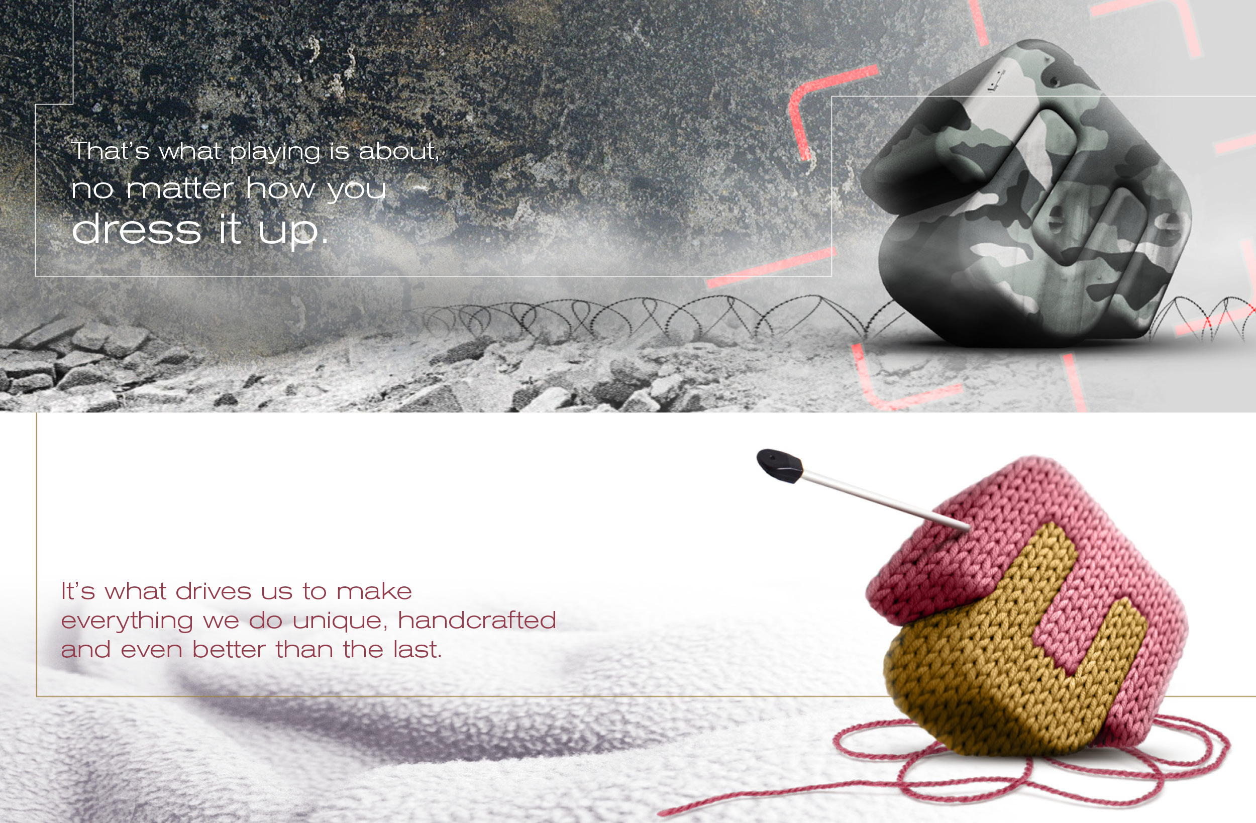
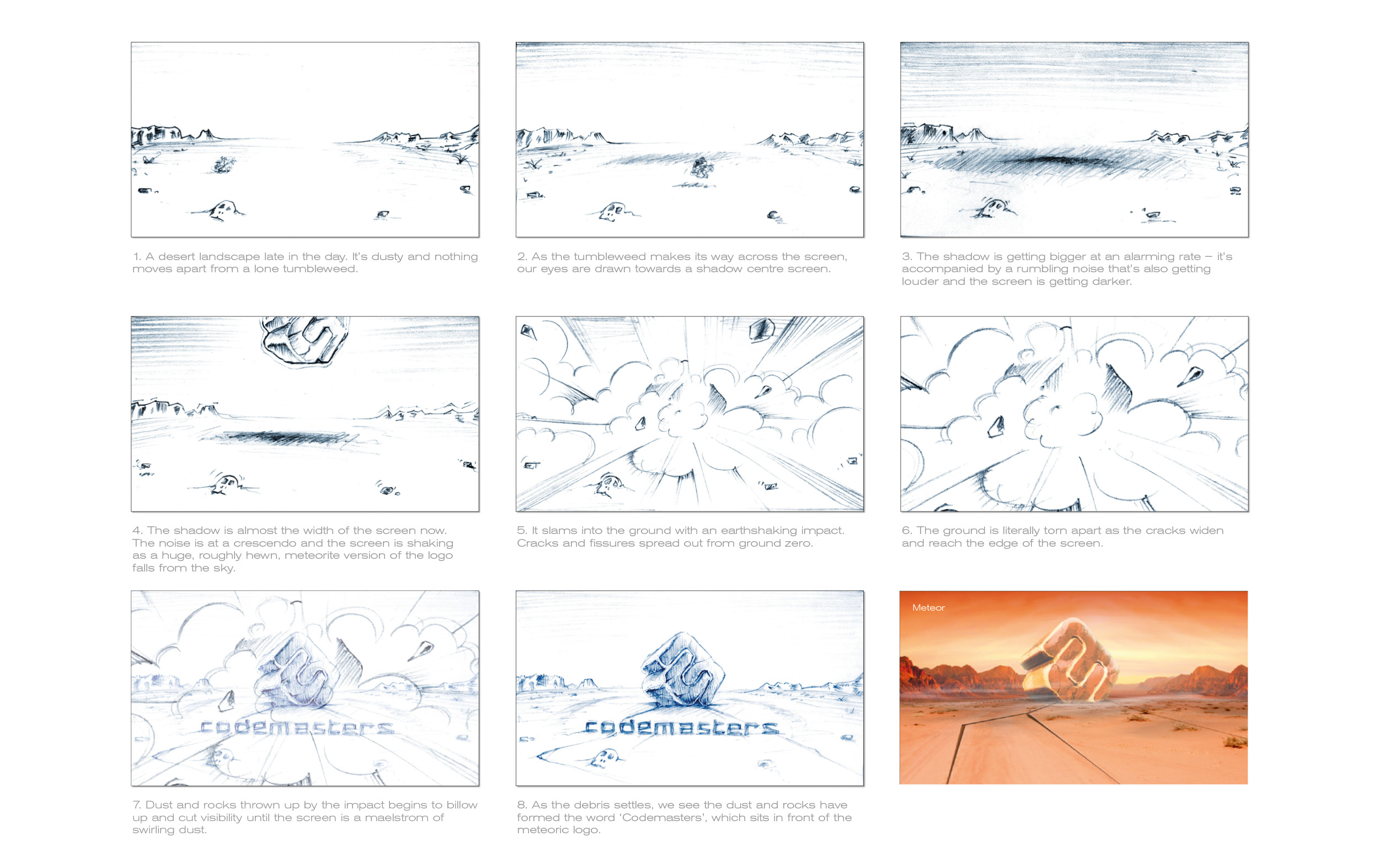
The logo could be played with and adapt to the the creative world of Codemasters as a whole and break the rules . It could be anything from a miniscule atom right through to a planet-destroying asteroid.
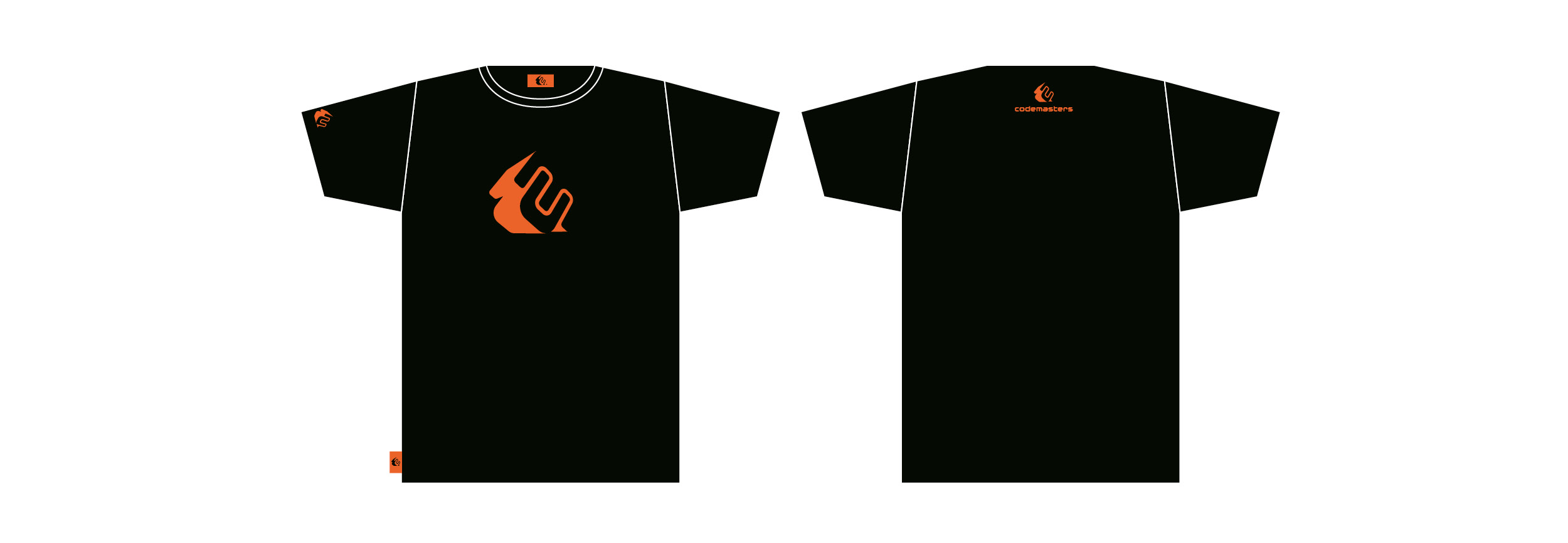
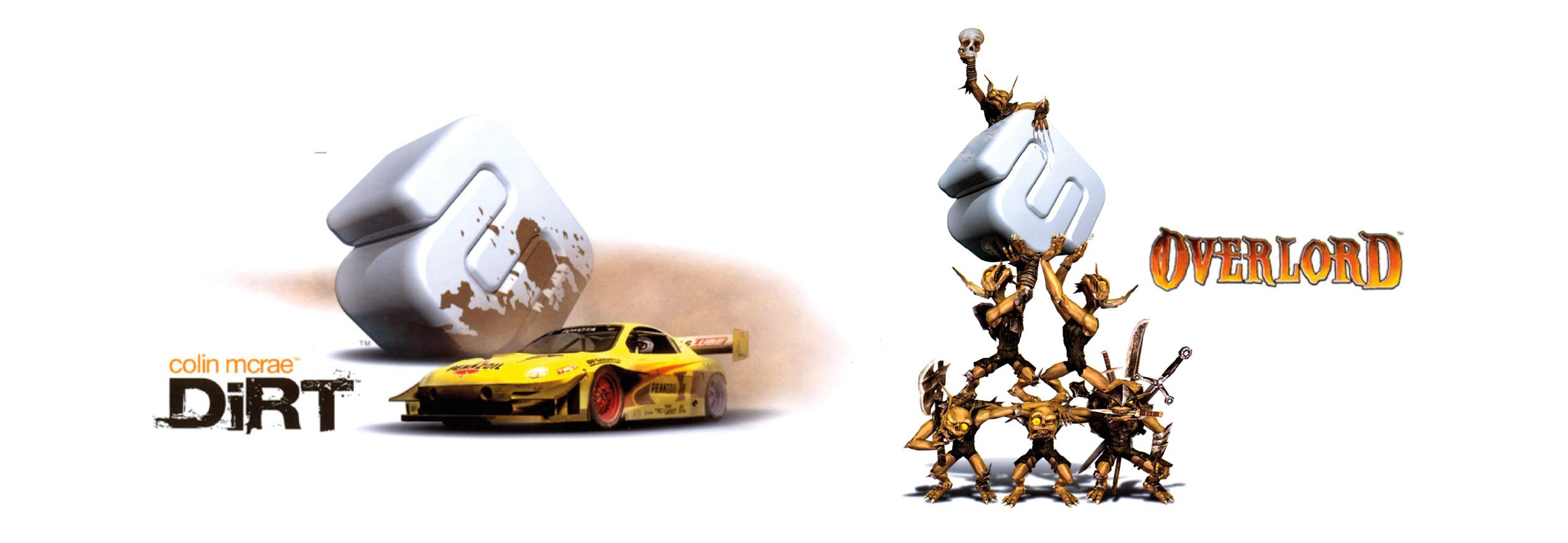
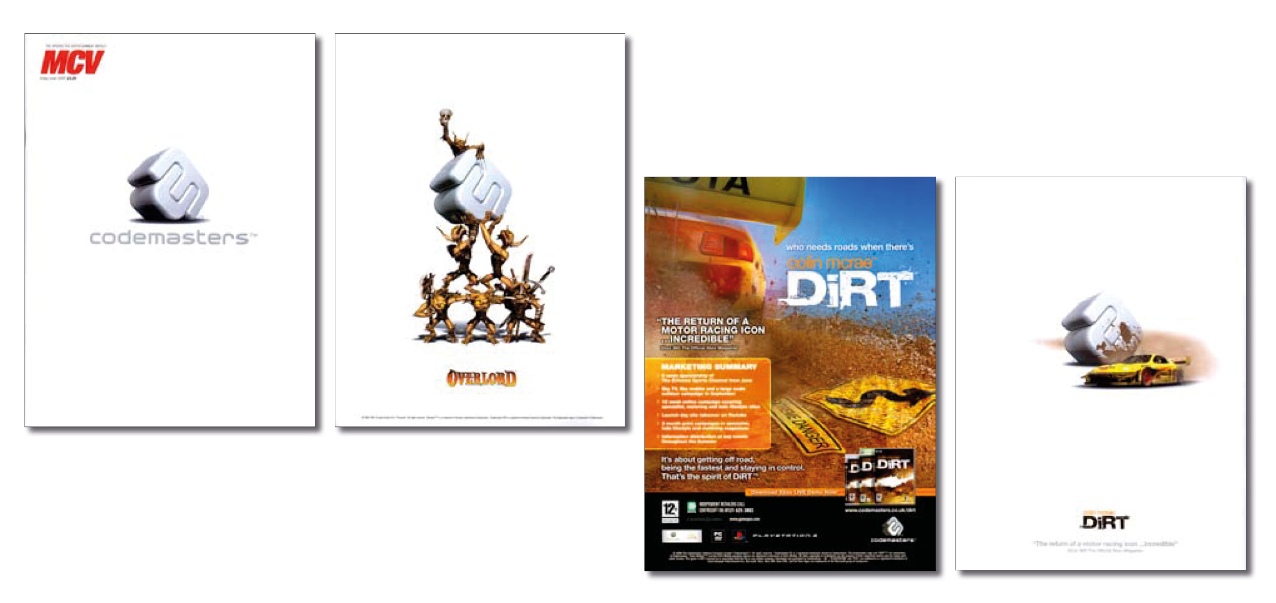
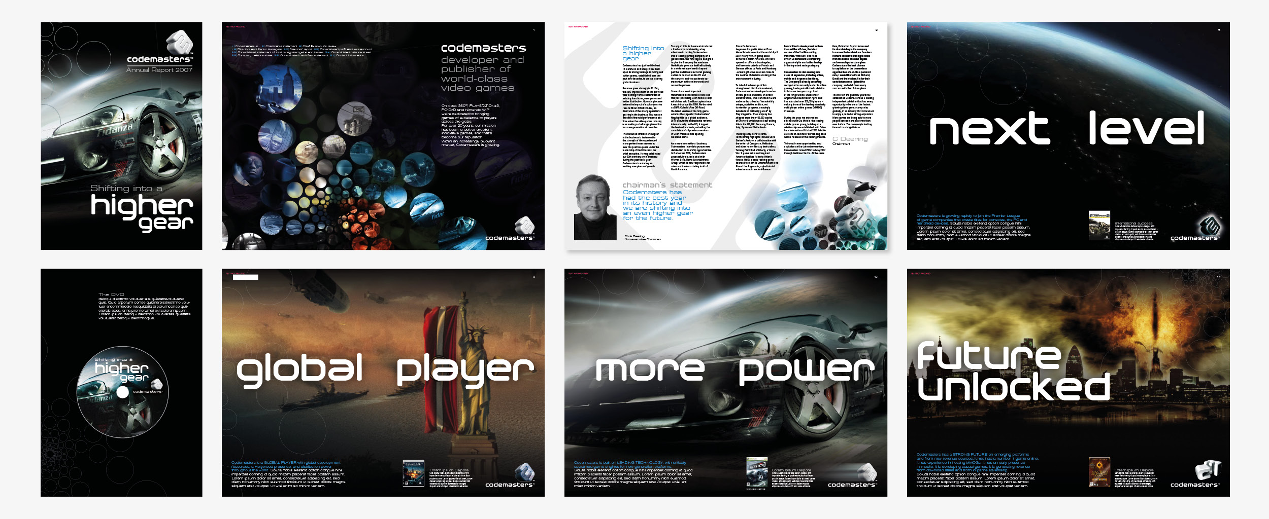
From 3D sculptures of the logo, game idents, online and TV ads to print ads and branding throughout their offices, the new logo became part of the fabric of Codemasters.
EVOLUTION



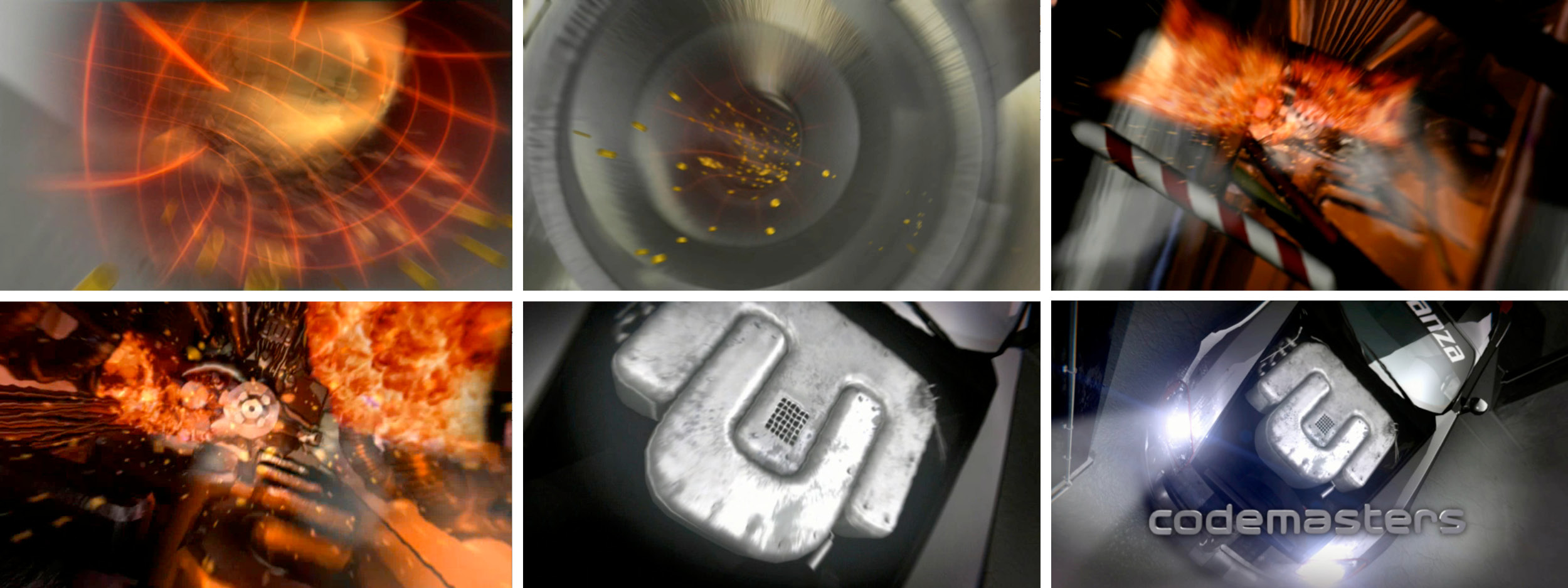
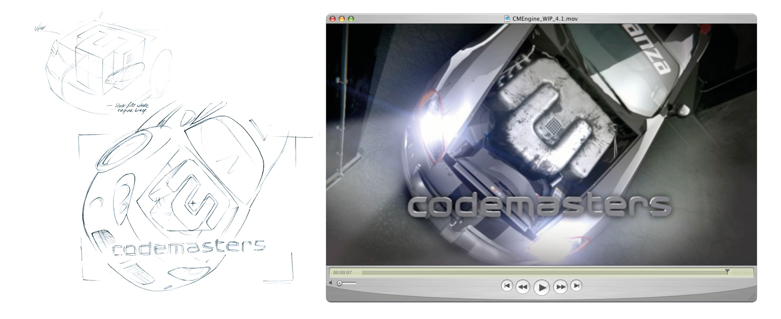
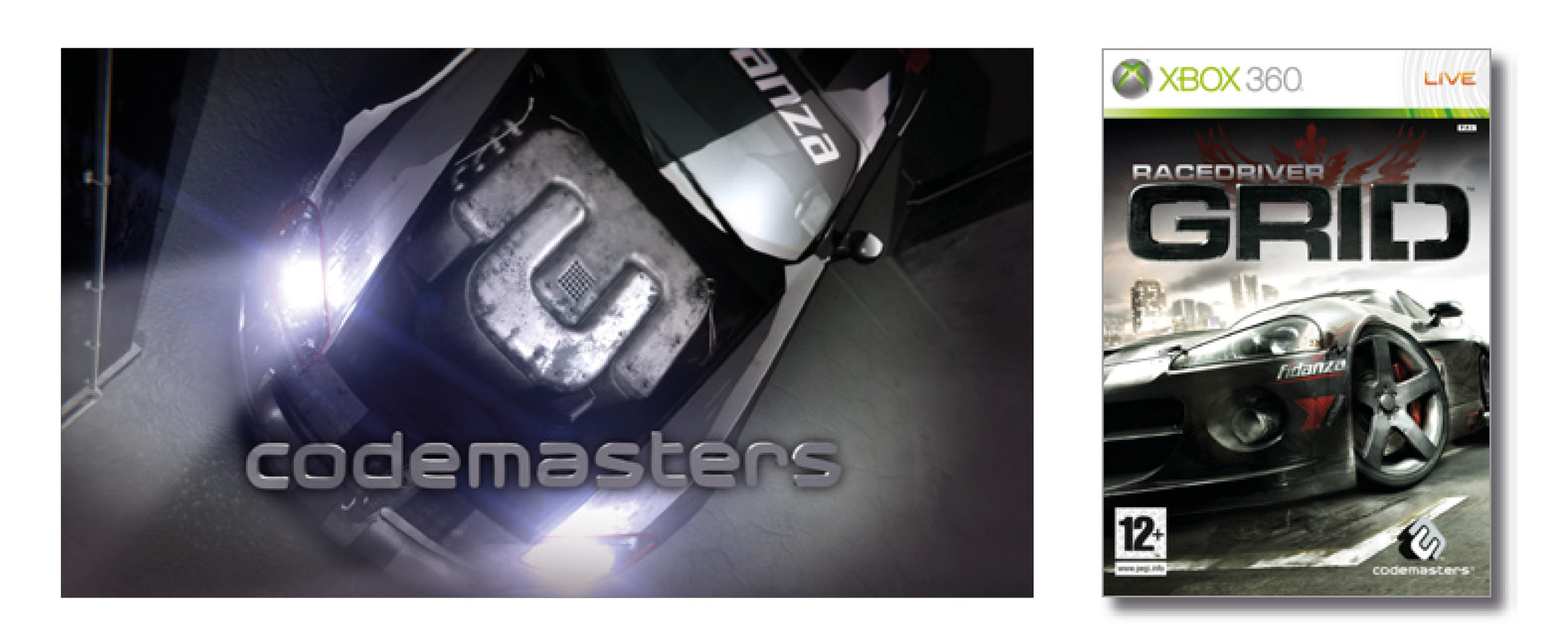
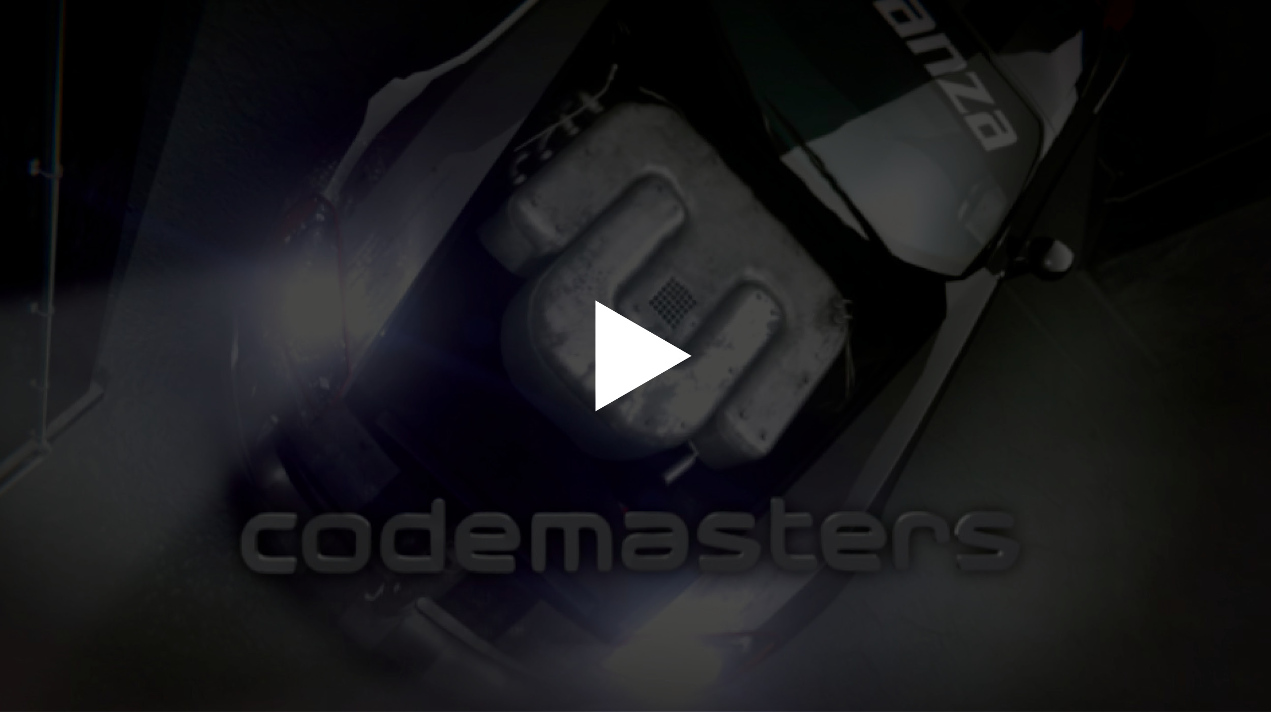
Racedriver GRID in-game ident
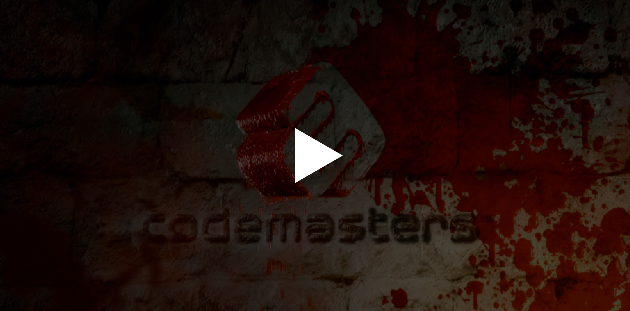
Jericho in-game ident
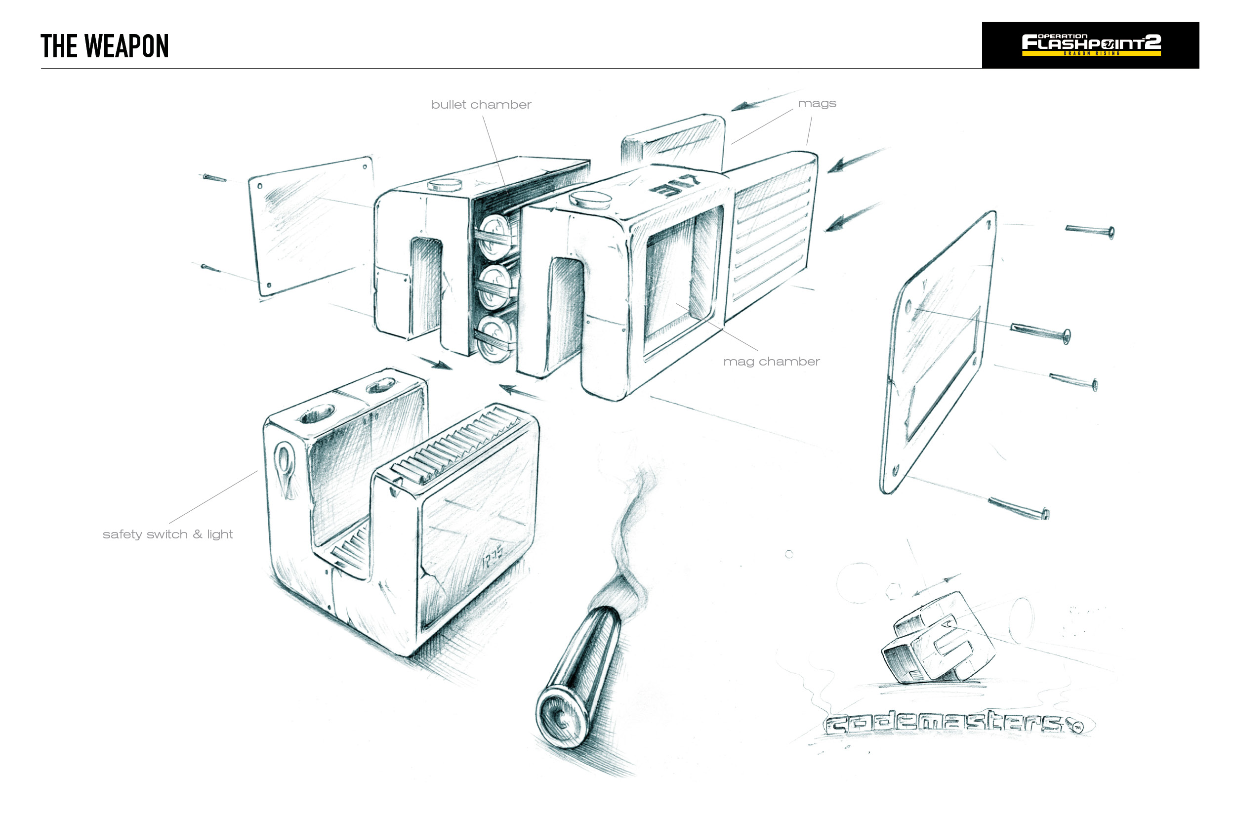
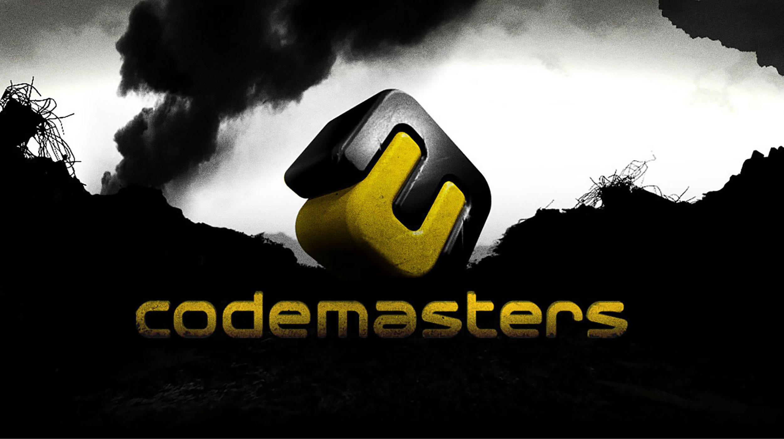
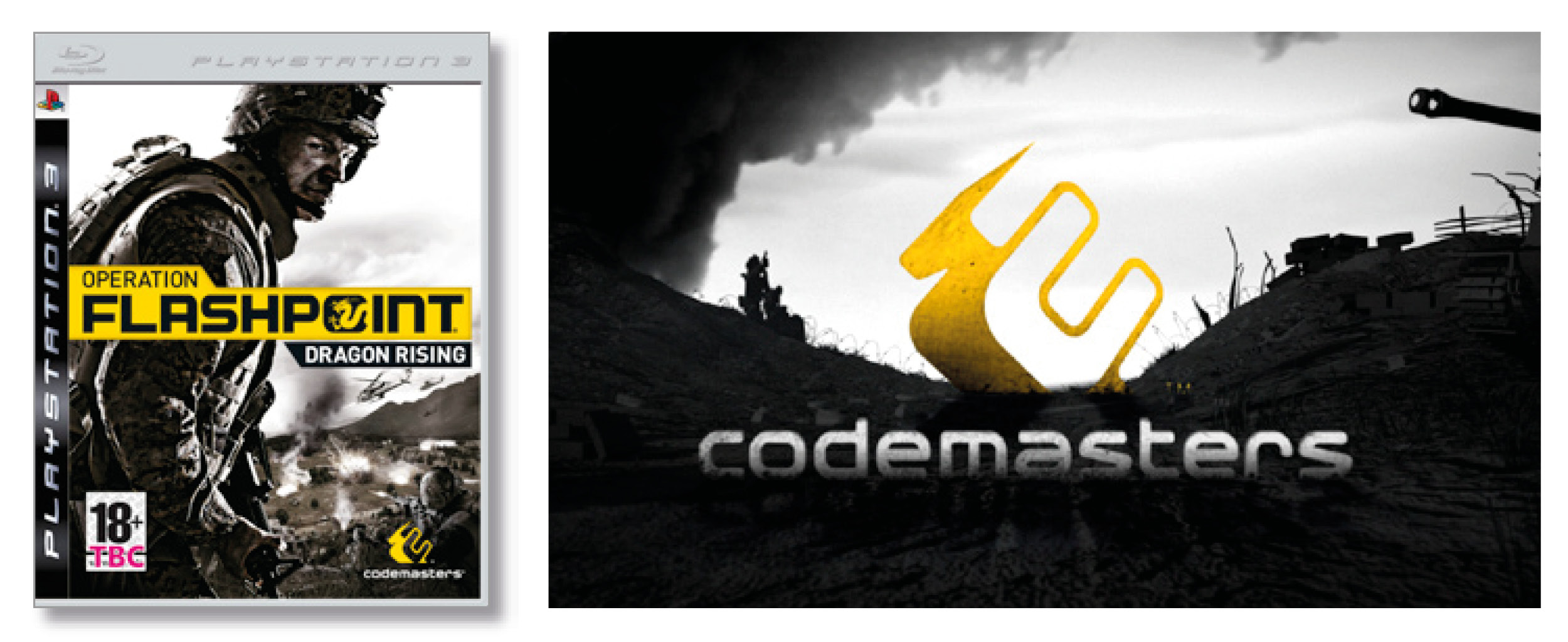
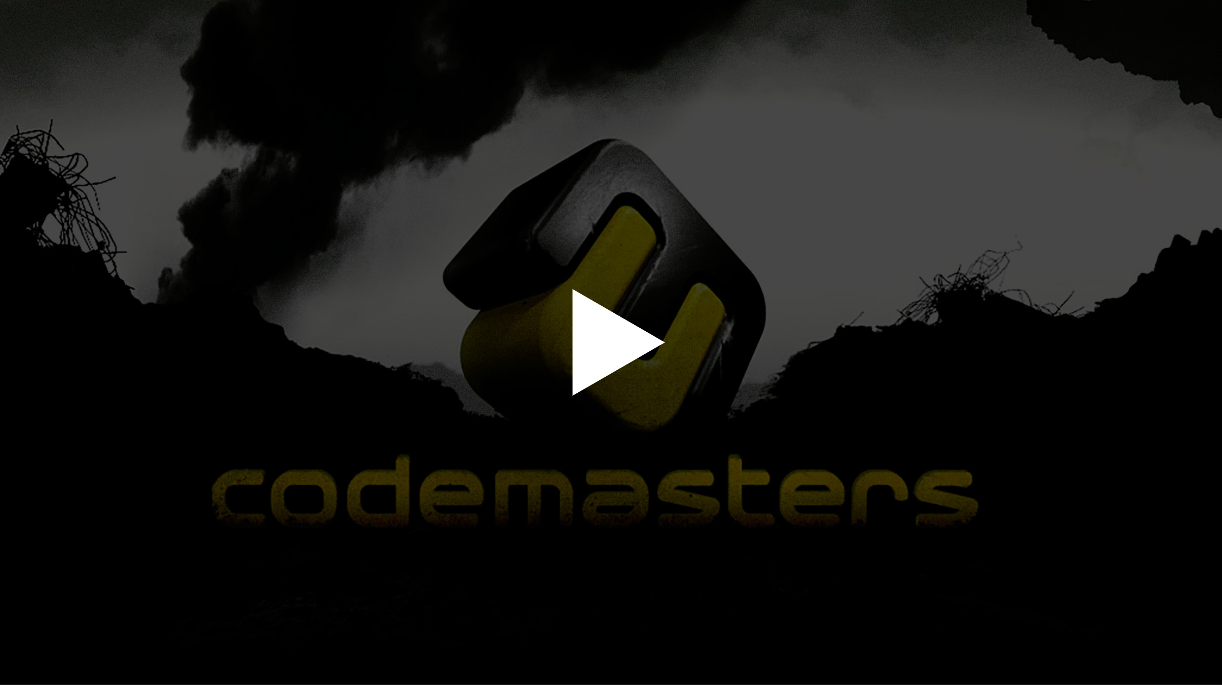
Operation Flashpoint in-game ident
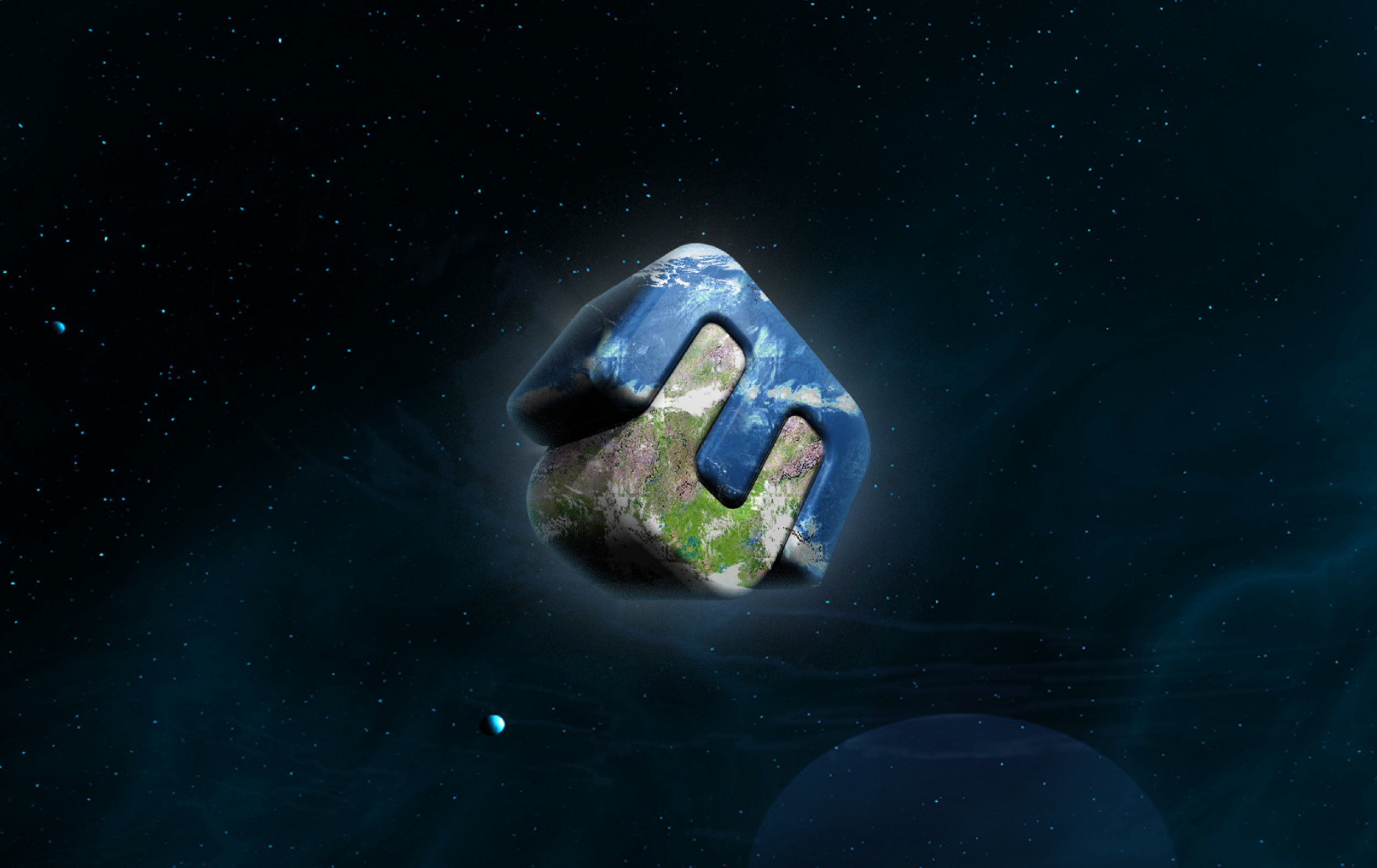
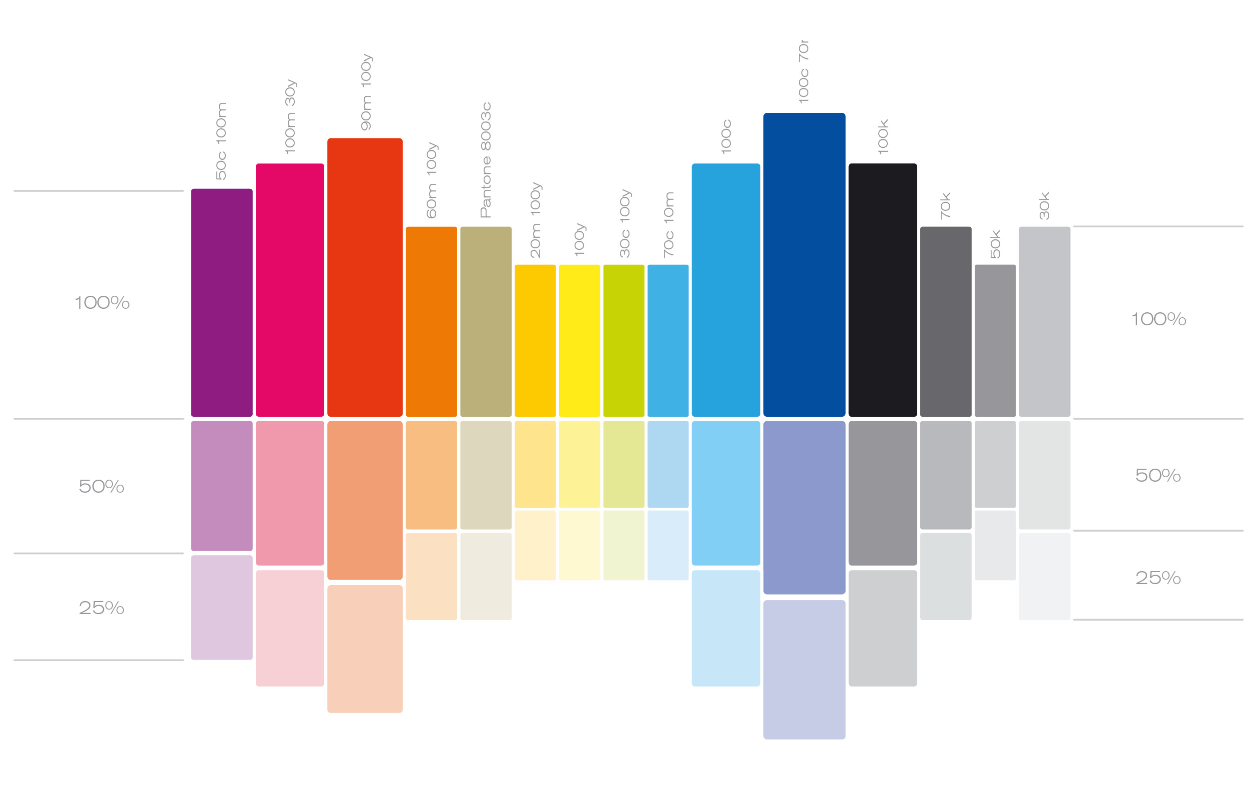
“The new Codemasters logo is bold and enigmatic and its introduction is a further milestone in the progress of the company. Much like our in-house talent, the new logo can flex its creative muscles. It doesn’t have a set colour; it may appear in a wide range of colour or tonal combinations. To that end, it’s a logo that always has an element of the maverick about it, which reinforces the creativity and playfulness of Codemasters as a whole.”
Rod Cousens C.E.O.
